Every product reaches a moment when its foundation begins to strain under the weight of growth.
For Intercom, we encountered this moment when it became clear that our Information Architecture (IA) – the framework that organizes how features, settings, and workflows fit together – was struggling to keep pace with the development of our product.
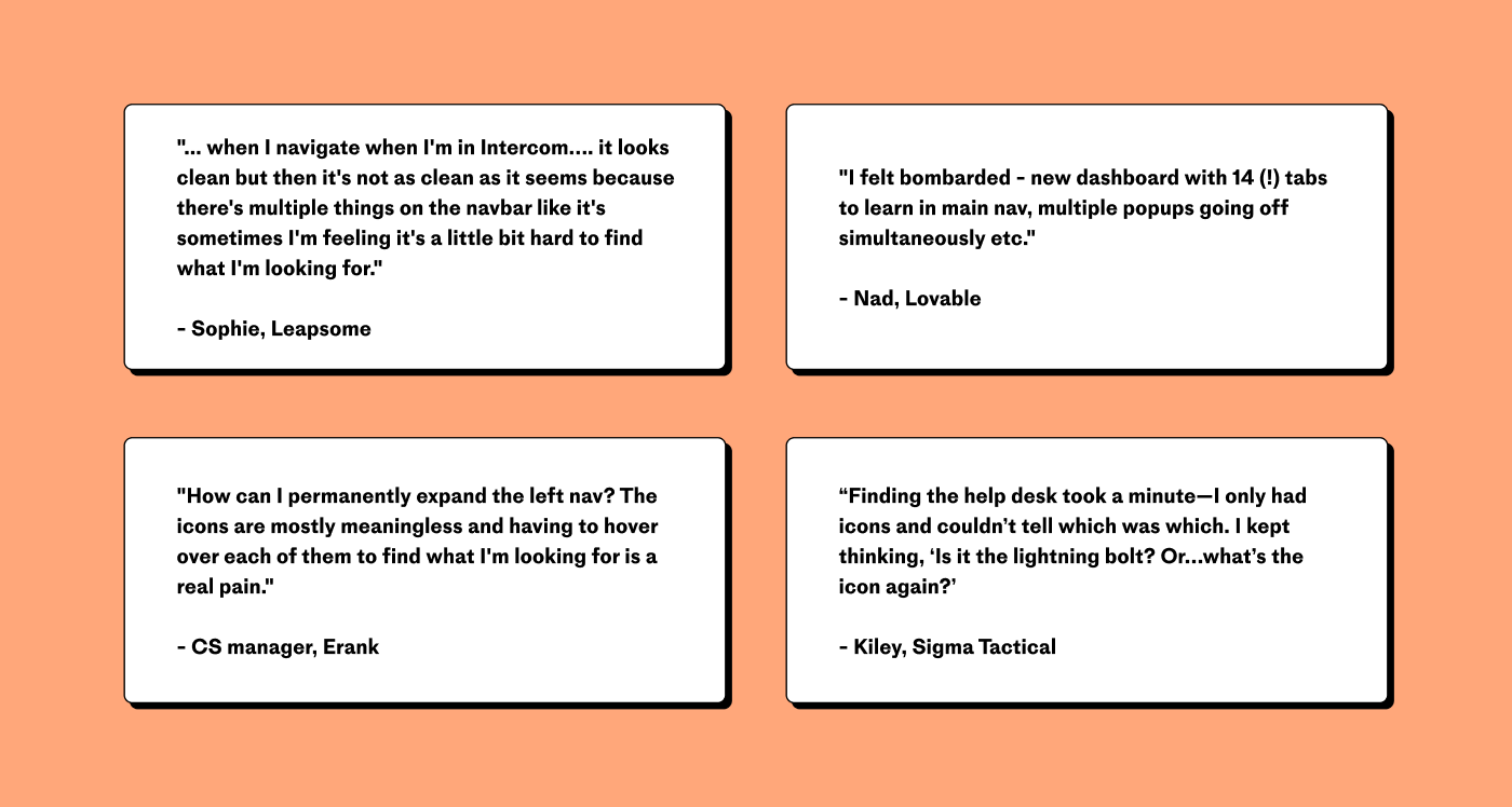
It wasn’t broken, but it wasn’t serving our users anymore. Workflows were harder to locate, settings were scattered and confusing, and some navigation labels left users unsure of where to go. One user described it as “wandering through a maze of features”.
The signs were clear – it was time to pause, reflect, and redesign.
A user entering the product for the first time was met with a navigation that had grown into a long list of icons
Where do you even start?
Restructuring IA is like trying to rebuild a busy train station without stopping the trains. You need to map out the flow of people, understand their needs, and remove obstacles – all without breaking what’s already working.
Our starting point was clarity. We asked ourselves:
- How can users find what they need faster?
- How can teams know where new features belong?
- How can we build a system that grows with us?
These questions became the foundation for every decision we made.
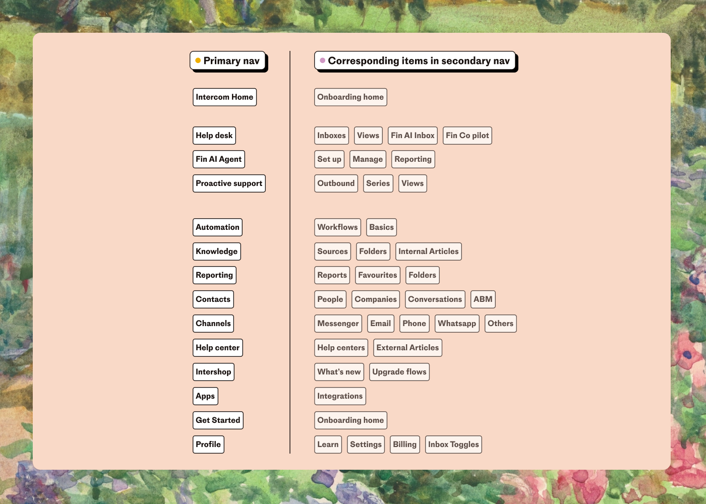
An overview of the Intercom app’s previously complex menu structure
The hard part: Making it simple
Simplifying isn’t about cutting corners; it’s about bringing order to complexity. To do that, we had to ask a fundamental question: How do we create a structure that feels intuitive without sacrificing depth?
The answer wasn’t obvious. Clarity meant different things to different users. For some, it was about eliminating redundant pathways; for others, it was about creating dedicated spaces for rapidly evolving tools. To uncover these varied needs, we spoke to dozens of users – teammates, admins, and first-time explorers of the product. Through methods like card sorting exercises and in-depth user interviews, we gained invaluable insights into how people approached navigation, where they got stuck, and what they wanted to accomplish.
These conversations and exercises revealed patterns that became the foundation for our redesign. They helped us identify recurring friction points and prioritize solutions that would resonate across diverse user scenarios. The challenge wasn’t just to reorganize – it was to rethink what organization itself meant for a growing product.
We distilled these insights into four guiding principles that shaped every decision we made.
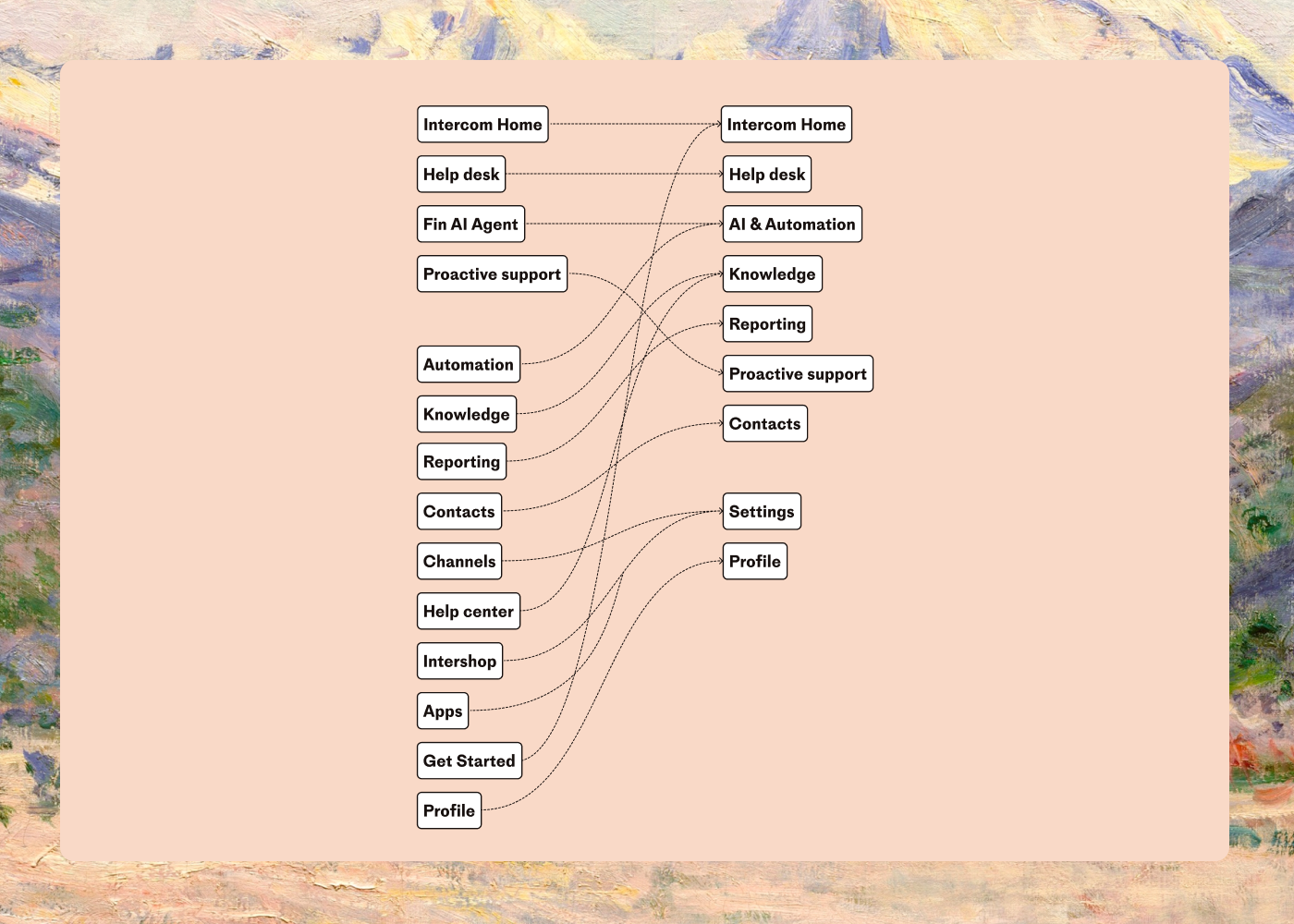
Simplifying the top-level information architecture involved reducing all the items on the left into the more intuitive categories on the right
1: Bringing similar things together
When users needed content management tools, they often toggled between Knowledge and Help Center, unsure of the boundary between the two. This fragmentation led to confusion: “Am I in the right place?” they’d ask. By merging these areas into a single destination, we removed the ambiguity and created a unified starting point.
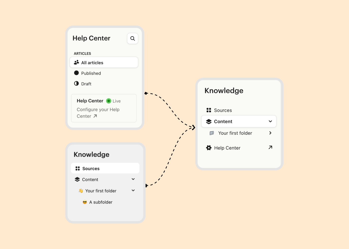
2: Creating a home for AI and automation
AI has become an essential part of how our users build, manage, and scale their work. Yet, its tools were scattered, often feeling like add-ons rather than an integrated experience. To give AI its rightful place, we created a dedicated section – a hub where users can find, experiment with, and grow their automation efforts. Importantly, we’ve built this space with flexibility in mind, leaving room for the innovation we know will come.
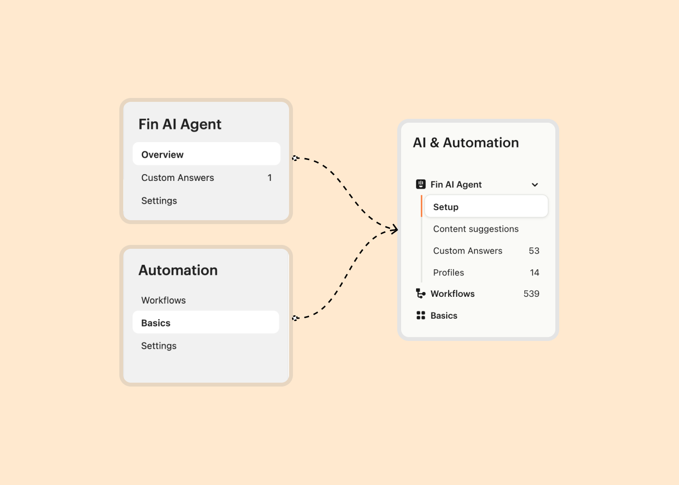
3: Reducing noise to focus on what matters
Not everything belongs in the spotlight. Some features, while useful, added unnecessary weight to the main navigation. By relocating these to relevant workflows or settings menus, we made room for the core elements that truly drive value.
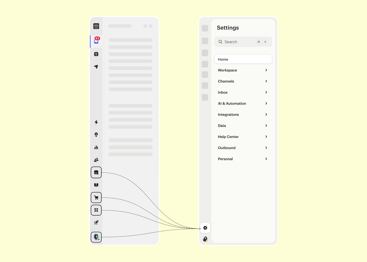
4: Streamlining personal settings
Personalization is powerful, but only if it’s accessible. Previously, personal settings felt like a scavenger hunt, scattered across multiple areas. By consolidating everything into a single “Personal” section, we created a path that feels logical and effortless, allowing users to adjust preferences without frustration.
These changes weren’t just about tidying up; they were about transforming how users navigate and interact with Intercom. Clarity became the thread that tied these principles together, guiding every decision we made.
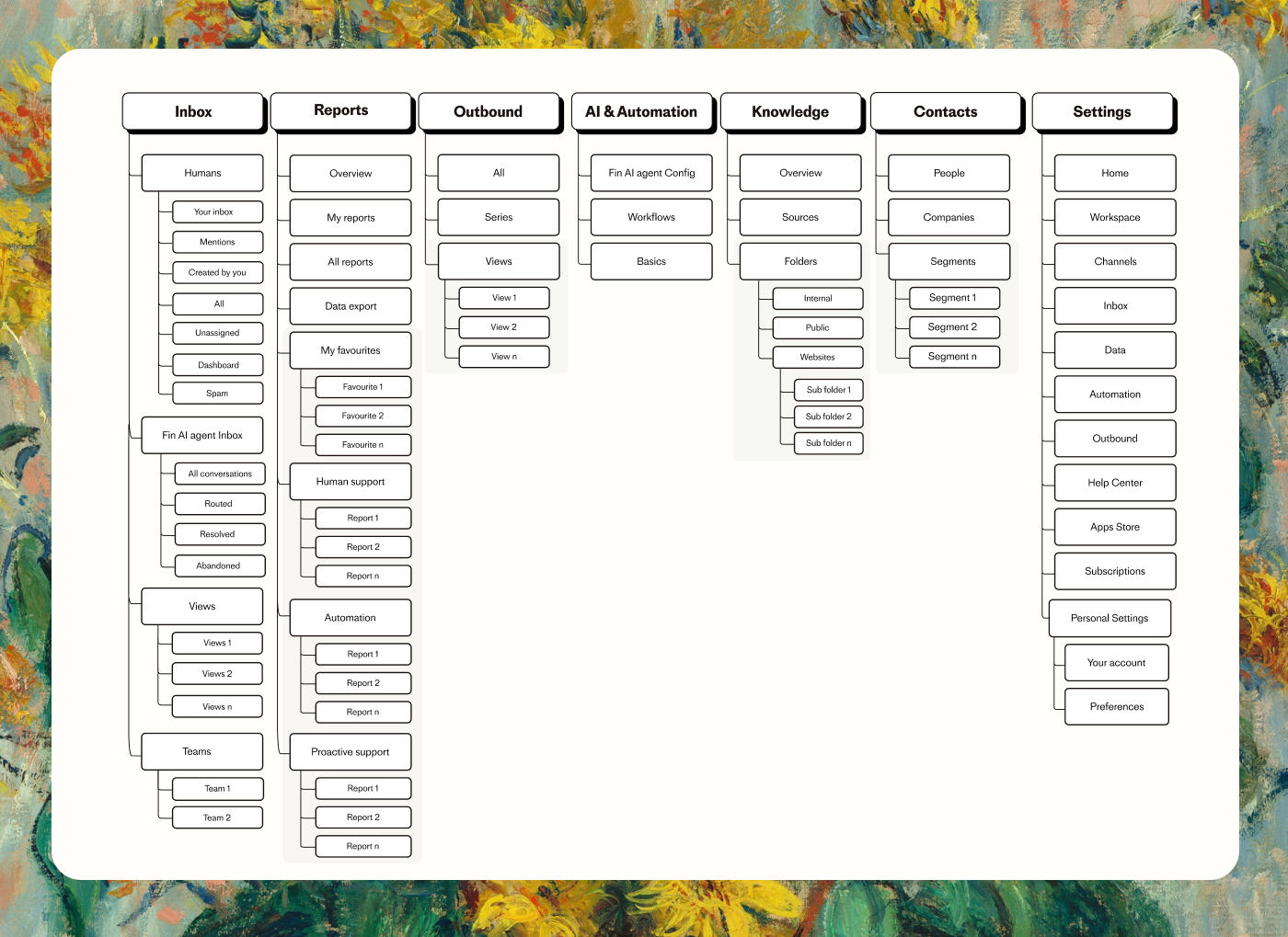
An overview of the Intercom app’s redesigned menu
Rethinking navigation design
The visual design of navigation plays an essential role in creating a product that feels intuitive and efficient. At Intercom, we faced a recurring issue with cryptic icons in the primary navigation. Users often hovered over these icons to understand what they signified, leading to unnecessary delays and inefficiencies. This issue was particularly costly in contexts where time equals money, like customer service workflows.
To solve this, we introduced a visually cohesive overview of labels that reveals all icon meanings simultaneously, rather than requiring users to hover over each one individually. This redesign wasn’t just about speed – it was about presenting information in a way that feels clear and predictable at a glance, reducing cognitive load and creating a more fluid navigation experience.
At the secondary navigation level, we uncovered an even bigger opportunity to optimize clarity. Features like Fin AI Agent, while always present in the primary navigation, lacked prominence within related sections, like Inbox. Despite its transformative value in resolving over half of customer queries automatically, it was hidden within submenus, leaving users unaware of its full potential. By visually elevating Fin AI Agent within its associated sections, we made it more visible and accessible without altering its established place in the primary navigation.
Consistency became a guiding principle as we extended these improvements across the app. Whether it was Inbox, Knowledge, Contacts, or AI and Automation, we ensured that every secondary navigation followed the same visual patterns. This included adopting a clean, minimalist folder structure, the right hierarchy and introducing customization options. Customers can now pin and unpin items in their secondary navigation, allowing flexibility while maintaining a consistent base layout.
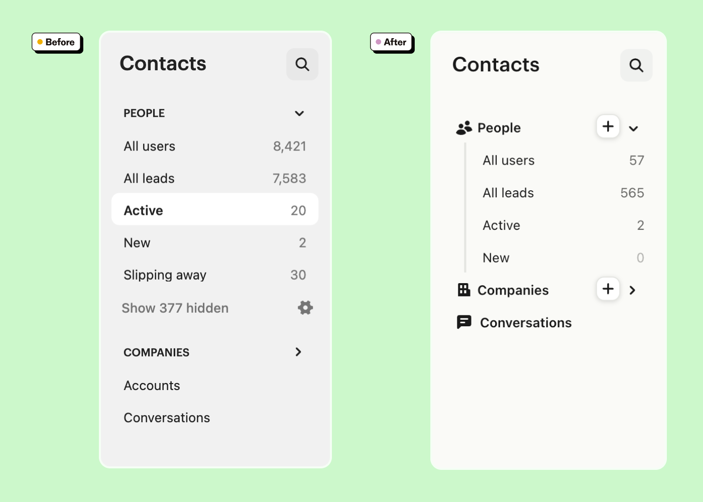
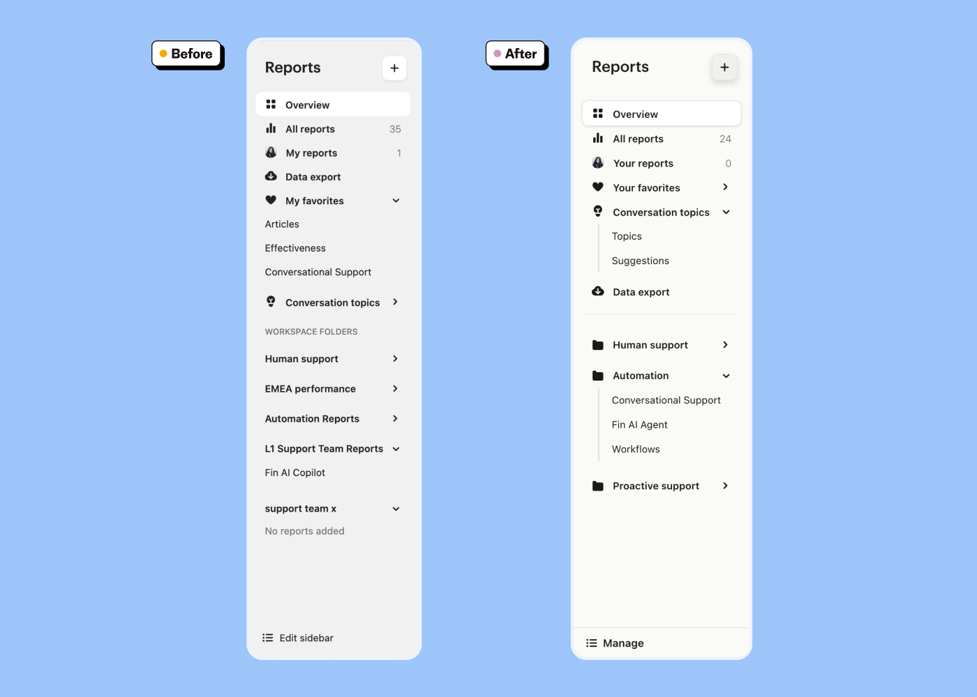
By aligning the visual design across all six core sections of the app, we ensured that users could easily predict where to find information. The subtle visual cues and patterns such as consistent spacing, uniform iconography, and aligned interactions helped create a cohesive experience. First-time users can now quickly grasp the app’s structure, while returning users benefit from reduced friction and a sense of familiarity. Ultimately, these changes made navigation not only easier but also visually intuitive and enjoyable.
How we got there: Messy, iterative, collaborative
IA projects can feel overwhelming. There’s so much to untangle, and it’s easy to overthink every decision. But we leaned into a messy, iterative process that made space for learning and collaboration:
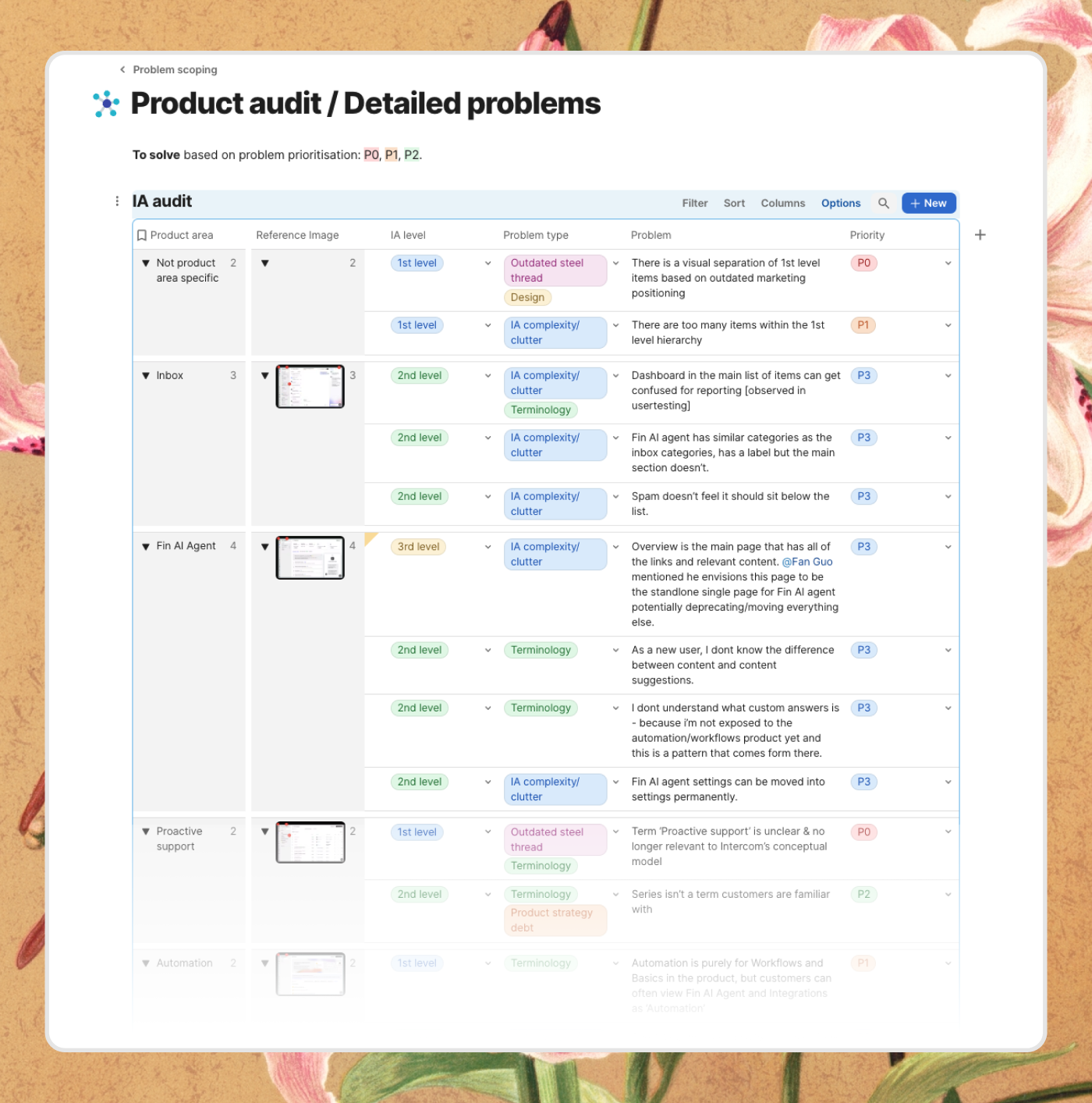
Listening first: We started by digging into user interviews and analytics to understand where people got stuck and what mattered most to them. This gave us a clear picture of the problems we needed to solve and the opportunities we could lean into.
Collaborative mapping: We mapped out the new IA, working closely with teams across the company. We grouped features based on how users think and work rather than how they were built, aligning structure with user goals and simplifying navigation paths. These workshops balanced user needs with business priorities and surfaced areas where the old structure was holding us back.
Bringing structure to life: Once the IA took shape, the next challenge was ensuring it worked for real users. A great IA isn’t just about what goes where – it’s about how users experience it. We tested ways to make the navigation clearer and easier to use, experimenting with layout, spacing, labels, and interactions.
Prototyping played a key role in this phase. Low-fidelity prototypes allowed us to test the structure and navigation in context, gather feedback, and make iterative improvements without slowing down. Each cycle brought us closer to a design that not only reflected the new IA but also made content easier to find and use.
A collection of iterations that were tested and helped build confidence
This process wasn’t perfect (no process is), but it got us closer to what mattered: a structure that worked for real people, not just our internal business logic.
The result: Breathing room for everyone
When we shipped the new IA, the changes were immediate, and the results spoke for themselves.
For our users, navigating the product became less of a chore and more of an intuitive journey. Tasks that once felt like treasure hunts were now straightforward paths. One user shared, “It finally just makes sense.” That single sentence captured what we had been working toward: a product that feels like second nature.
For our teams, the transformation was equally profound. Clearer guidelines for where features belong meant fewer debates, less confusion, and more momentum. Suddenly, decisions that used to take hours were made in minutes, freeing up time and energy for the work that really matters – building great features.
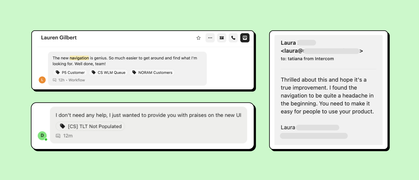
But the real win was something deeper: we created space. Space for users to focus on what matters to them, whether it’s solving customer problems or creating workflows. Space for teams to move faster, with less friction. And space for the product itself to grow in ways that feel effortless, not forced.
It wasn’t just about fewer clicks or clearer menus. It was about making everything feel lighter.
What we learned
Looking back, there are lessons we’ll carry forward, not just for IA projects but for everything we design:
Design for real people, not edge cases
As much as we like to think we understand our users, testing reminded us how much we can miss. For example, while we thought grouping AI tools into one section was obvious, early tests revealed that users weren’t sure what “AI” encompassed. It wasn’t enough to group features logically; we had to make their purpose clear, too.
Real people don’t use products in perfectly predictable ways. They come in with an infinite variety of needs, assumptions, and goals. Designing for them requires listening deeply and solving for their realities – not our ideal scenarios.
Simplicity takes effort
If simplicity were easy, every product would feel effortless. But getting there is hard work. It’s messy, iterative, and requires constant trade-offs. We debated labels, reworked structures, and tested prototypes over and over. Every iteration brought us closer to the clarity we wanted, but it came with its fair share of disagreements and dead ends.
The takeaway? Simplicity isn’t the starting point – it’s the result of relentless focus and persistence.
IA is never done
IA isn’t something you “finish.” It’s a living, breathing system that evolves alongside your product and your users. What works today might not work tomorrow, and that’s okay. This redesign is a step forward, but it’s not the end of the journey.
We’ll keep listening, learning, and iterating. Because a great IA doesn’t just grow with the product – it grows with the people who use it.
The bigger picture
At its core, this project wasn’t just about reorganizing menus or renaming sections. It was about something more fundamental: clarity.
Clarity isn’t just a design decision; it’s a principle. It’s about removing friction so users can focus on their goals, creating frameworks that teams can build on, and laying the groundwork for a product that scales gracefully.
We know this isn’t the last time we’ll revisit our IA. Products grow, user needs evolve, and clarity itself is a moving target. But for now, we’re proud of this milestone. It’s not the final word, but it’s a meaningful chapter – one that’s already making a difference for everyone who interacts with Intercom.
Shout out to the core team that worked with me on this crucial project: Bethany Clark, Oisin Hurley, Tatiana Bassil, Lajos Fazekas, Ahmad Raza, Mugundh Muthuvel, and Paul Finnegan.
